We relished the opportunity to craft a holistic service and experience for a brand-new product. We began with on-premise intercept interviews and user research including their banking needs and preferences, their aesthetic preferences, and their personal goals around financial goals and ideals.
The Problem
The client had been in the financial services and banking industry for over 53 years, but none of their products had been designed for the modern, mobile banking needs of millennials, and younger generations.
Additionally, how do you launch a mobile-only banking app in a space already saturated? How do you stand out?
Our Approach
We relished the opportunity to craft a holistic service and experience for a brand-new product. We began with on-premise intercept interviews and user research including their banking needs and preferences, their aesthetic preferences, and their personal goals around financial goals and ideals.
- We performed competitive analyses of all the major mobile banking apps to discover what they were doing well, and where they had gone astray. We signed up for and performed basic banking tasks across each platform, documenting, recording, and presenting our findings to each other.
- We ran multiple information architecture studies to refine the mobile IA (information architecture) flows, hierarchies, and strategies.
- During the low-fidelity prototype stage, we ran multiple usability studies to continue to refine, and inform not only how they wanted to perform the various banking tasks, but what other services and needs weren’t being met that our new banking app could fulfill.
- Before writing a single line of code, we ran multiple studies against the high-fidelity prototype with actual customers recruited on-site and remotely to resolve any issues with IA, UX, UI, accessibility, and usability before buildout began.
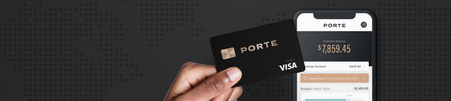
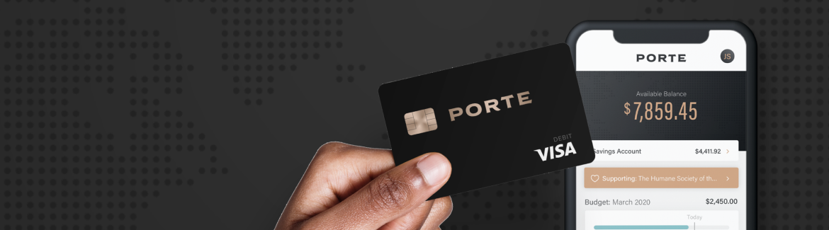
- Due to the success of our Service and UX research, the client engaged us to also design and implement the card design, social media concepts, marketing website, and copy. We even produced teaser videos leading up to the product launch. This meant additional research and testing of the social media imagery, copy, and tone. We also designed and tested the product mailer experience and card; everything from paper, media, layout, card materials, and more.
- We then performed additional usability testing of the functional mobile app to test, verify, and tweak as needed.
The Results
We tested so much and so often, each member of the team, from designer to project manager to developer felt like we knew the people we were making the product for intimately. This meant the user’s goals and needs were always at the core of the product. When debate arose about anything (colors, fonts, features, priorities, etc.) the user’s needs were always the focus, rather than the egos or preferences of the team.
We sought to craft a banking solution with these core tenets to not just stand out from the competition, but above it:
- It’s a financial tool, not just a place to store and retrieve money
- It represents the user’s personality and values
- It helps the user build financial independence
- It’s a tool for good, that makes the user feel good
- It’s the kind of banking experience we all wish we’d had
- Radical transparency, and avoidance of fees as much as the business would allow
- A mobile app requiring significantly lower support call volume compared to the client’s other product offerings
The Wins
- iOS: As of 9.24.23, >3,400 reviews, for a 4.8 ★ rating
- Android: As of 9.24.23, >8,600 reviews, for a 4.7 ★ rating
- Support calls are comparatively low to sibling apps
- Even the MVP (minimum valuable product) had enough features to draw new users to the platform
- Test participants give the UX/UI/SD of the platform 4.5/5 aesthetic ratings and SUS scores well over 85%.